Coffee Run delivery app screens
Logo + Color Palette + Type hierarchy
User flows
Coffee Run Sketch wireframes
COFFEE DELIVERY APP
Coffee Run App
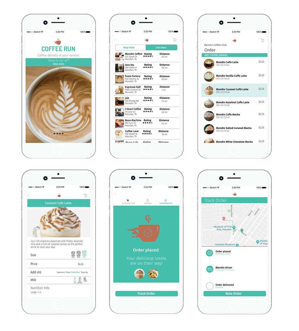
Coffee is an essential part of the day for a huge population of people, including this designer! With the hectic schedules many of us face, the idea of having coffee delivered presents a convenient solution to that daily fix. With that in mind, I created Coffee Run as the delivery app with everything you need to get that hot cup of coffee in your hands in no time. Key features include being able to search on a map to view nearby cafes and their ratings, placing an order for coffee and treats, tracking your order, and rating your overall experience.
Full Prototype: https://invis.io/AUPVLO1C9F6
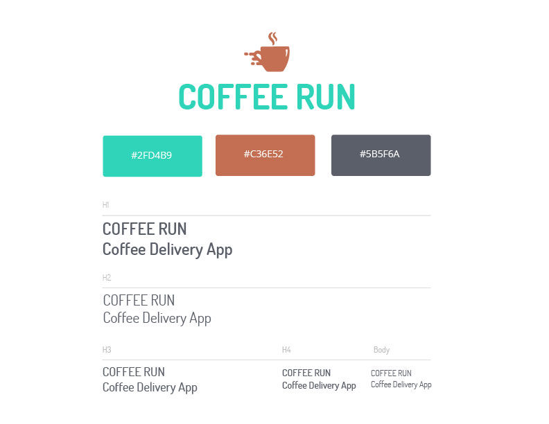
Color Palette + Typography
When it comes to coffee, earthy rich tones of mahogany and sepia tend to come to mind. Coffee Run is meant to be modern, friendly and accessible, with an emphasis on efficiency, reliability, and ease. The rich stable cocoa color plays well off the modern, fresh aqua as we see in the logomark juxtaposed with the logotype. A clean, sans serif type style compliments the overall tone we are trying to achieve. Setting up a consistent typography style helps maintain a strong visual hierarchy. This gives users clear navigation cues throughout all screens in the application.
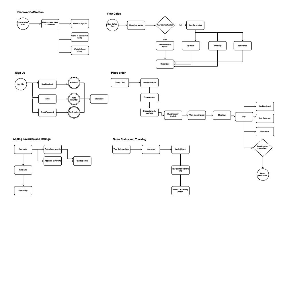
User Flow
It was important to map out the user flow of the app before fleshing out wireframes. I tried to step inside the mind of the user as they would go through each step of signing up, exploring cafes and drinks, placing an order and then tracking their order. Research showed that people preferred utilizing their social media account to sign up. I used Balsamiq to create the user flow.
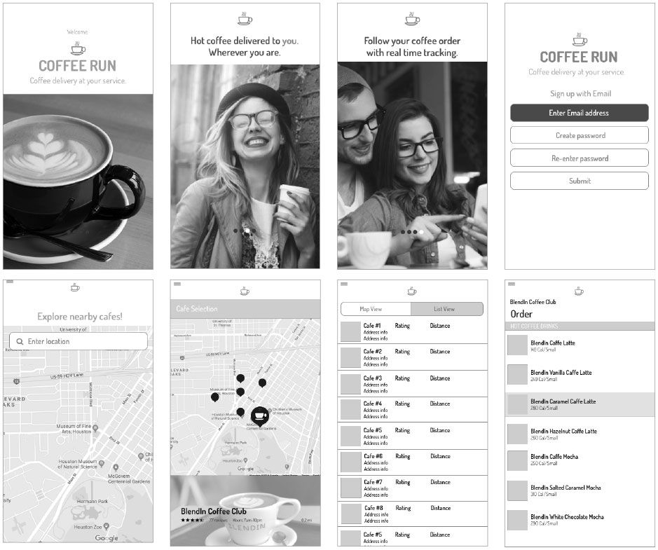
Preliminary Wireframes & Testing
After first sketching out wireframes on paper, I developed some rough wireframes in Sketch. It helped to get a basic idea of how the app would operate. User testing played
a major role in discovering the strengths
and weaknesses in the design. After several iterations and user tests, the final wireframes were designed.